Window light photography: one object, three views
BEAT AI / PHOTOGRAPHY NOTEBOOK
You can learn a lot about light without buying another lamp. Put one everyday object near a window, then make three photographs from different positions. The object stays where it is; your viewpoint changes. Comparing the pictures helps you notice the direction of the light rather than searching for a universally correct setting.
This 15-minute window-light exercise works with any phone or camera. Your photographs can stay private. Use a mug, a leaf, a folded cloth or another small subject you can put on a stable surface.
Take the photographic guide with you. Download One mug, three moods: the free two-page printable PDF (10.3 MB). It includes front, side and back light illustrations, a 15-minute exercise and space for your own observations. The photographs are AI-generated illustrations. No email signup is needed. The full practice folder also keeps the earlier comparison worksheet.
Watch: one mug, three moods
The new 55-second photographic lesson gives each lighting example about twelve seconds on screen. Pause whenever you want to compare.
Open the film, photographic examples and written exercise on Beat AI. No sign-in is needed. The film uses AI-generated illustrative stills with gentle transitions and original instrumental music.
Set up one small scene
Choose a window you can work near safely, with room to move around the subject. Keep the object on a steady surface. Do not climb, lean outside or move into a place where photography is unwelcome. A plain background makes the first comparison easier, but it does not need to be an expensive backdrop.
For this first attempt, avoid mixing in extra lamps. Window light changes with weather, time and nearby surfaces, so the exercise does not promise identical results in every room. Start by writing: “I want the viewer to notice…” You might choose a clear shape, a surface texture or a quiet mood.
Make three views of the same object
Try to keep the subject a similar size in each picture. Make the photographs close together in time so a sudden change in daylight is less likely to dominate the comparison.
- Front light: stand with the window behind you and photograph the subject. Check that your own shadow does not cover it. Notice how much of the visible surface you can read, and what the background contributes.
- Side light: move so the window is beside the subject from your viewpoint. Compare the lit and shaded sides. What happens to the shape, texture and edges?
- Back light: move so the window is behind the object from your viewpoint. Look at the bright window and the outline of the subject. The subject may look darker; a silhouette can support an idea, but lost detail may work against another one.
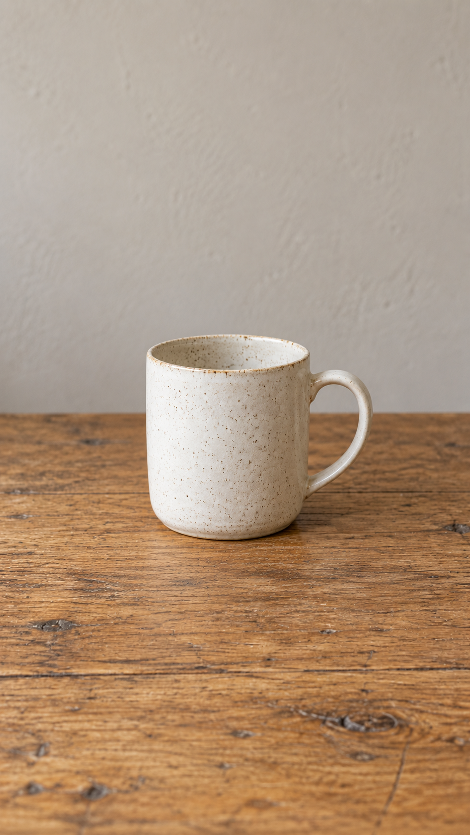
Front light
A softly lit front.
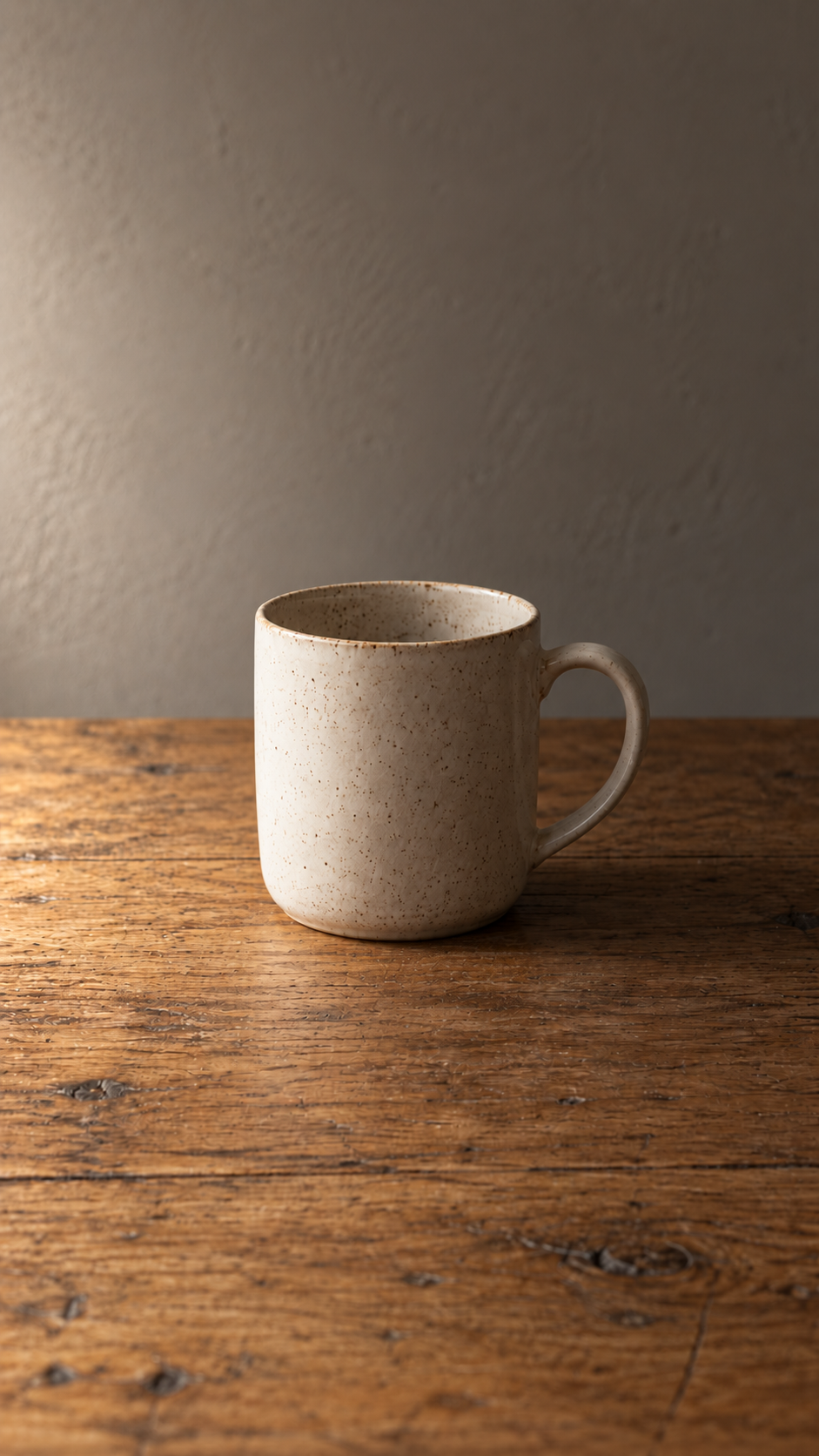
Side light
Light and shade across the mug.
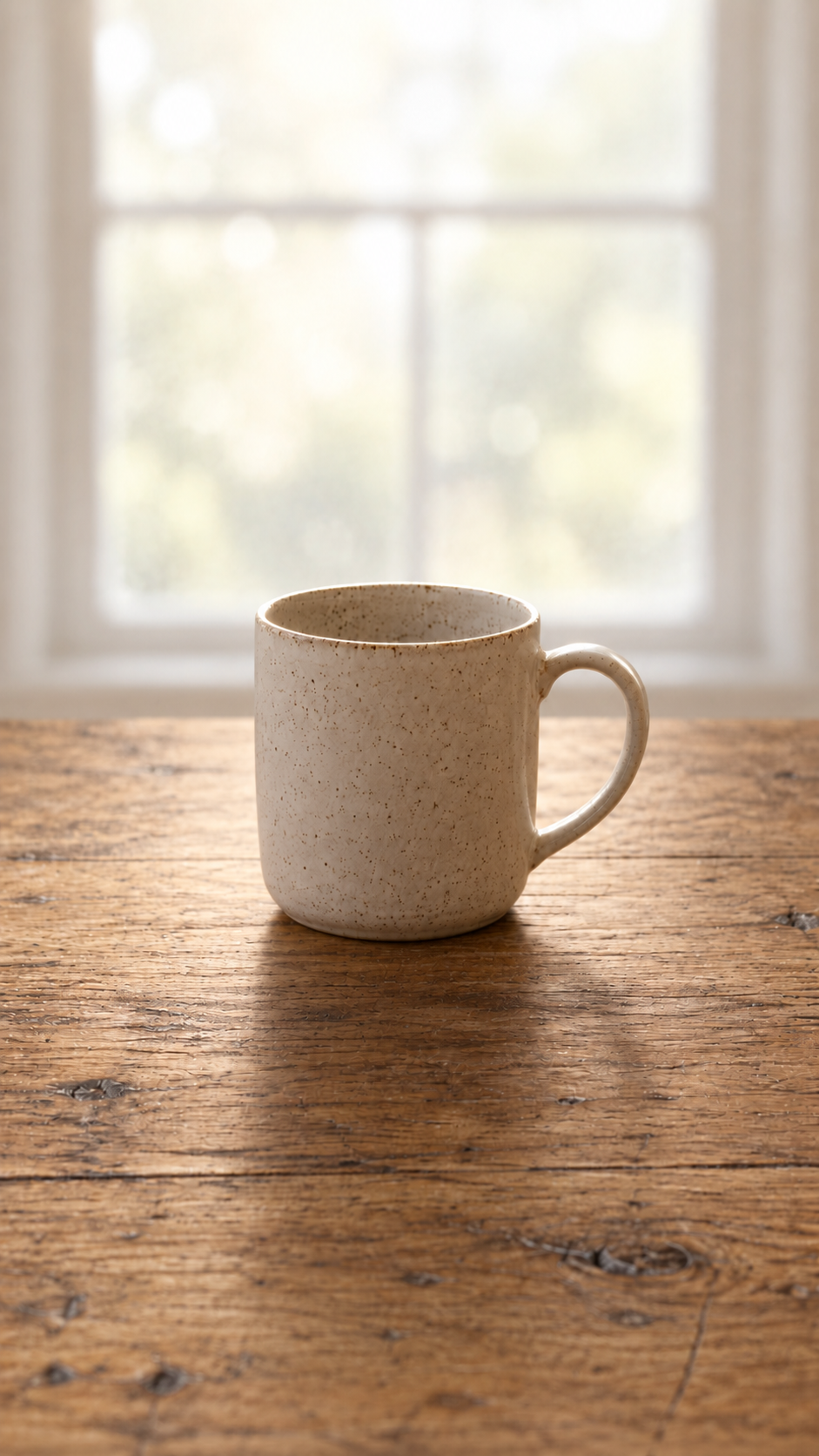
Back light
A brighter background and darker front.
Compare before applying different edits
Open the actual photographs at a similar display size. A gallery preview can crop a picture, so check the complete frame. Start with what changed in the subject and its surroundings:
- Which view makes the detail you wanted easiest to see?
- Where are the brightest areas, and do they compete with the subject?
- What do the edges of the object look like?
- Does the background explain the scene or interrupt it?
Phones and cameras may adjust brightness automatically as you move. Treat that as part of what happened, rather than claiming you isolated every variable. If a bright window or a dark subject makes the picture hard to read, try adjusting exposure using your device's normal controls and make another frame. Keep the first three for comparison.
Choose for the idea, not the rule
There is no single best direction of light for every photograph. Front light might show the surface clearly, side light might reveal texture, and back light might give you a shape you like. Those are possibilities to test in your own scene, not guaranteed effects.
Write one useful observation: “The side-lit frame shows the folds I wanted to emphasise” or “The darker outline is clearer against the window.” Then choose one change to try next. That is a more repeatable practice than simply keeping whichever thumbnail looks most dramatic.
For help comparing several photographs, try the contact-sheet exercise. The notebook resource page brings together written guides, short demonstrations and the free private practice journal.
Want a fresh brief after practising? Explore Beat AI's daily photo challenge. Beat AI is in public beta. Read the current dated brief and deadline. Sign in to submit your original photograph; browsing and voting don’t need an account. This private exercise is separate from competition entries.
Comments
Post a Comment